The Ingredients of Identity
Table of Contents
“My kid could have drawn that” is what one client told me when I asked for payment towards the logo I designed. This happened early in my career, and though I don’t design logos anymore, I have since maintained an interest in visual identities and what their owners have to say about them.
During a visit to the Wipro campus earlier this year, I noticed that their logo had changed. It was no longer the familiar, rainbow-coloured sunflower from the late 90s. The new logo, a series of concentric dots spilling out of the O in Wipro, has been around for seven years now, but I had not paid it any attention up until that moment.
tl;dr – I don’t like it.
To be fair, designing a visual identity is not easy and anything that is hard to do is easy to criticize, especially when it comes to acts of creation. So, I’m going to try and explain what it is about the new Wipro logo that leaves me unsatisfied.
![]()
![]()
What is Visual Identity?
Our identities are distinct and persistent phenomena, an aggregate of our personality and predispositions, and as such, this applies to organisations as well. A brand’s visual-identity is the sum of the personality and culture of the organisation that it represents. This identity is unique to each organisation, and is typically enshrined in the brand guide1 that documents it’s visual-language.
The visual-language of an organisation, is what designers call the set of simple, recognizable elements—colour, shape, texture and typography—that combine to form a visual identity. Just as languages are unique to particular cultures, visual-languages also encode cultural meaning that is unique to organisations.
With international organisations, a visual-language has to be universal as well, because a customer in Costa Rica must relate to the logo as must one in Karnataka, so designers are aware of concepts such as universal or archetypal symbols which convey the same idea across cultures and geographies.

Which of these shapes would you call Bouba and which one, Kiki?2
![]()
![]()
Identity Design & Me
The last time Wipro changed its logo, I was fresh out of Art school. This was in 1998, and I was an idealist with rigid ideas on identity design. I remember that my peer group and I mocked the crude, kitschy, rainbow-coloured sunflower that Shombit Sengupta, the founder of a studio called Shining Emotional Surplus, designed for Wipro.
I know better now, but back then, I was a youngster brimming with biases.
As a student, I believed that countries like the U.S. produced better graphic design than India. This idea persisted until I worked in the U.S. for a year, and learnt that bad design is universal. You see, as a student, the only American design I had seen were those published in books that showcased the best of American design!
My idealism eventually evaporated when it made contact with the real world. I realised that good design is often contextual to it’s goals, is not about subjective notions of taste, but about the outcome it achieves.
Wipro has operations across the world and works with clients from many industries. For an organisation with as large a footprint as Wipro, an identity change is no trivial matter. Their new logo3, a radical departure from the older one, is simpler, but have they made it harder to describe?
![]()
![]()
Identity as Salience

Which of these swans is easier to describe?
IMG SRC: Alex Newstead/BNPS
Some identities are more recognisable than others. This may be because of cognitive efficiency—the ability of the customer to describe the logo using the fewest mental steps possible. Salient identities grab our attention.
If a cloud in the sky forms a recognizable shape4, we remember it, because it is easier to describe when compared to other clouds with random shapes. The simpler the description, the more salient it becomes. Here is an example.
Consider these two series:
- 123456789
- 143859726
I could describe the 1st set as “a sequence of numbers from 1 to 9”. The second set is harder to describe. I see no visible pattern that makes description easy—the series seem random5. Some logos are memorable while others vacate our mind the moment we look away. It seems that salience is a way for our brains to detect a signal from background noise.
![]()
Which of these logos is easier to describe?
![]()
![]()
Identity as Signalling
If social media has taught us anything, it is that people like attention but only if it improves their reputation6. Think about our preferences on fashion and style. Sometimes we dress to stand out and, at other times, to blend in. There are different motives and social contexts for these actions (which sometimes leads to philosophical tensions with our identities). We want to be unique and at other times, we want to blend in—we try to attract attention or avoid it, if it seems to increase or conversly, decrease our reputation in our social circles. If people on social media are so preoccupied by engagement on their posts, it is because the attention of other people is a scare resource7

A teenager who dyes their hair pink and styles it as a Mohawk is, in a sense, hacking the attention economy of their social world. In a sea of ordinary hairstyles, they become simply, “that person with a pink Mohawk”. This person is sending a strong signal about their tribal affiliations.
This is identity affirmation through a form of costly signalling8. The pink mohawk demonstrates allegiance to their group, while on the other hand, it may estrange them from more conservative parts of the society.
Identity designers ask—what is the signal we are sending? What category do we wish to belong to? It is rare to find a logo for a corporate bank coloured in shocking pink, but it may be easier to find it among fashion brands. We are hardwired to categorise the world because stereotyping is a human trait—a formula that helps us differentiate self from the other.
![]()
![]()
Identity Through Differentiation
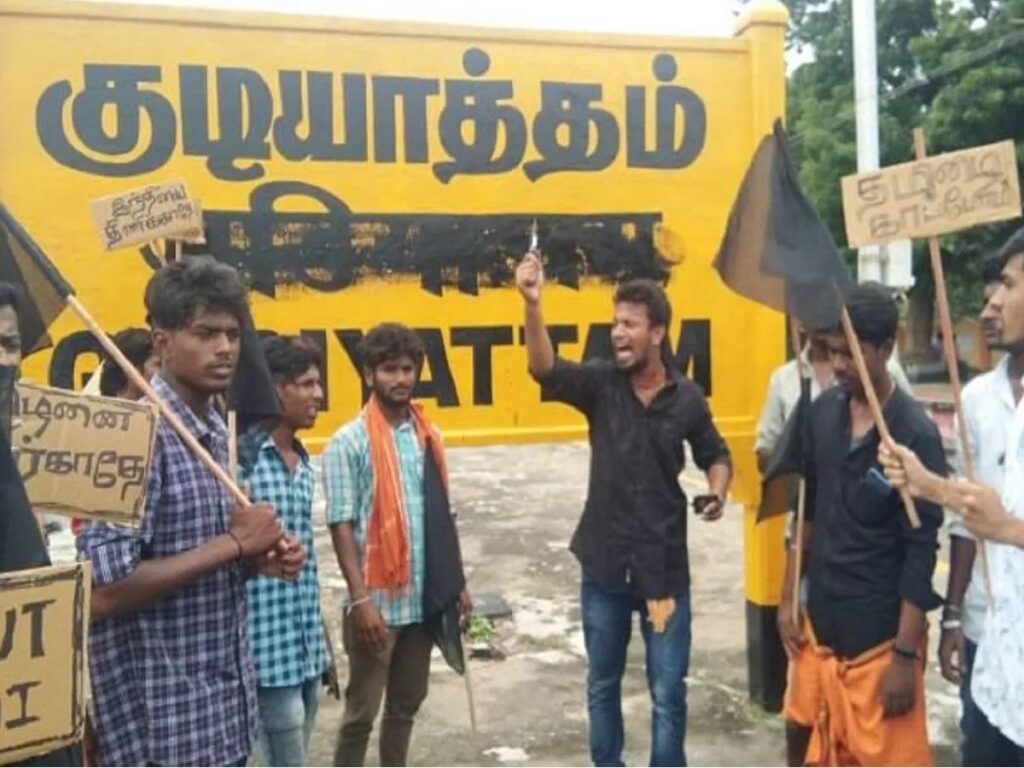
Tamil Nadu has been in the news lately because of their protests against the Hindi language. I am a member of Indian Subreddits where these language wars play out every day.
IMGSRC: thenewstuff.in
The state has been protesting what they claim as imposition of the Hindi language by the central Government for a long time and at the heart of these protests is Tamil identity9. These protests proclaim identity via negativa, that is, the assertion of Tamil identity by the denial of Hindi.
This is a familiar form of identity affirmation, and we see this playing out with great regularity on Social media. Alternative fashion pitted against mainstream fashion, IOS vs Android, one religious belief over the other.

An old Volkswagen ad positions the van as a counterpoint against its owner’s evolving political dispositions.
Brands position themselves through differentiation all the time. Consider Surf Excel’s ‘Daag Acche Hain’ ad from 2005. At a time when most detergents positioned themselves as a remedy for stains, Surf Excel went the other way, claiming that sometimes, stains are good10.
![]()
![]()
Among my favourite advertisments is Apple’s famous Superbowl ad from 1984, in which, a young heroine—the only colourful element in a dystopian world of greys—rebels against a big brother like character, positioning Apple as a creative force in a corporate world ruled by the likes of IBM.
![]()
![]()
Wipro’s old logo differentiated itself through the tagline, “Applying Thought”. Though I never saw the rationale explicitly stated anywhere, I have always assumed the tagline was a way to position the organisation as more than a back-office. The statement—Applying Thought—positioned Wipro as a ‘thinking’ company in India’s arbitrage driven service economy of the 90s and early 2000s.
That tagline has now disappeared from the new logo. Perhaps they no longer see it as a competitive advantage. The ultimate purpose of a logo after all, is profitability.

Sometimes visual differentiation matters, even across industry segments.
![]()
![]()
Running the Gauntlet of Corporate Approval
All creative exploration eventually arrives at the dreaded gates of corporate approval. The approval of the client determines if the logo goes out into the real world, or is relegated to the studio’s archives. The problem with presenting design concepts for approval is obvious—clients are rarely versed in design principles—so designers have to present the freshly minted identity in a language that the client team understands.
This tragicomic phase is a key point in any identity design project. Since educating a client on design principles in the short time it takes to present the identity is an impossibility, studios undertake other means.
When I was a graphic designer, I chose the stage magician’s method of misdirection. I presented weaker options to prop up the obviously strong ones. (To my occasional dismay sometimes the client would pick the weak one.) Others choose to go with the strategy of obfuscation, as the Arnell group did with its famous Pepsi logo redesign11 from 2008.
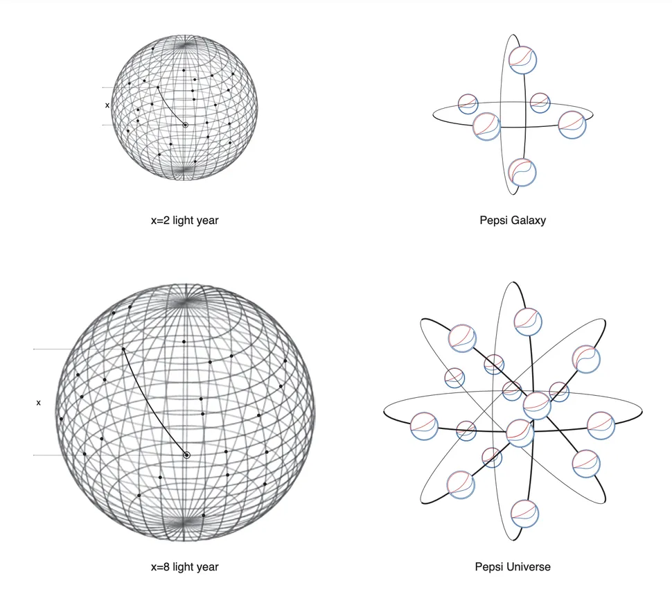
Fanciful poppycock from the Pepsi Identity Design document (2008)
In 1998, Sengupta, the designer behind Wipro’s old sunflower logo seems to have gone with an appeal to emotion—a bold choice, considering the transactional nature of boardrooms. He explained it like this – “The rational and functional base, with an emotional content, connects with people beyond their expectation where the competition cannot enter — creating emotional surplus. This was the thinking behind Wipro’s corporate repositioning in 1998 with the ‘Rainbow Flower’ identity.“
Some designers choose not to risk the design fee on the client team’s aptitude for design, and pick an option that is mainstream and generic. It feels to me, this is the route Landor took with the Wipro redesign.
![]()
What I find on a Google Image search for Stock Logo templates with circular design
I’m not the only one dumbfounded by Wipro’s decision. The former Chief Marketing Officer of Wipro seems surprised, by the choice, as do brand gurus.
Firstpost quotes the Chairman, Mr.Azim Premji as saying, “Our brand identity is a visual expression of what we do and mean, for our clients … Our re-articulated values connect and resonate deeply with the new, vibrant identity…” which, if you ask me, is the kind of statement that does this redesign perfect justice.
Changelog
Updated references to include Tamil Nadu protests – Wednesday 05 March 2025
![]()
![]()
Footnotes
The Pepsi Redesign Document: Download it here
On Brand Guides: Download Wipro’s Brand Guide. (PDF document) ↩︎
On Universal Imagery: In 2001, Vilayanur Ramachandran and Edward Hubbard conducted an experiment using college students in America and Tamil speakers in India as subjects. They found that 95-98% assigned the name “bouba” to the rounded shape and “kiki” to the jagged one. ↩︎
On the performance of a new logo: With new identities, it is hard to say how well the customer will recognise or recall a logo, or how it may differentiate the brand from it’s competition. If the organisation has a large marketing budget—as Wipro most certainly does—it can inundate the market with its visual identity, compelling recognition and recall through brute force. ↩︎
On Pareidolia: Researchers think we see recognisable patterns in random places, such as faces in clouds or in coffee stains, as a function of natural selection. There is prudence in first fleeing, rather than waiting to fully confirm if the sabretoothed, tiger-like pattern in the undergrowth is an actual sabetoothed tiger. ↩︎
On Algorithimic Complexity: Wikipedia describes algorithimic complexity or Kolmogorov complexity as “a measure of the computational resources needed to specify the object”. The math is greek to me, but I get the gist of the concept. ↩︎
On Simplicity Theory: Closely associated with Kolmogorov complexity is an idea proposed by Jean-Louis Dessalles and associates, known as Simplicity Theory. It proposes that simpler objects are salient to us because of a drop in complexity. The Simplicity Theory website has some great examples. ↩︎
On Social Media and Reputation: A study found that the nucleus accumbens, a region of the brain associated with motivation, addiction and reward seeking behaviour is activated, and predicts the intensity of Facebook use when people percieve gains in personal reputation. ↩︎
On Attention: The psychologist Herbert Simon wrote that “In an information-rich world, the wealth of information means a dearth of something else: a scarcity of whatever it is that information consumes. What information consumes is rather obvious: it consumes the attention of its recipients.” ↩︎
On Costly Signalling: Some types of signalling behaviour is costly to us. I can honsetly say that my art school education did not prepare me for the real world, and yet I endured 5 years of banal classes because I expect potential employers to take me seriously. 5 years of time and effort, all to produce a degree that I could flaunt is definitely costly signalling. ↩︎
On Identity via Negativa: Tamil Nadu may have a point. A recent study by The Hindu finds that – “Over 90% in Hindi-belt states speak only one language, while the rest of India is more bilingual.” ↩︎
On Differentiation: In similar vein to the Surf Excel ad, see Dainik Bhaskar’s Good stubbornness contrasted against bad stubbornness. See https://youtu.be/7CJ01F4EpBc ↩︎